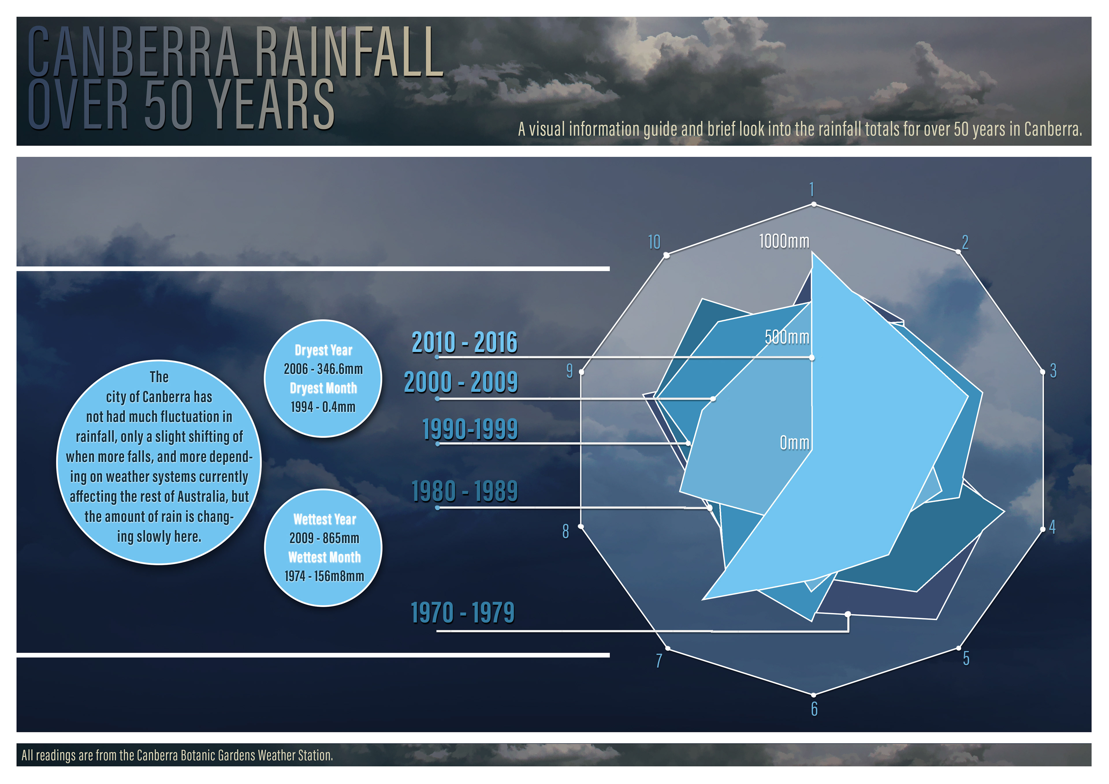
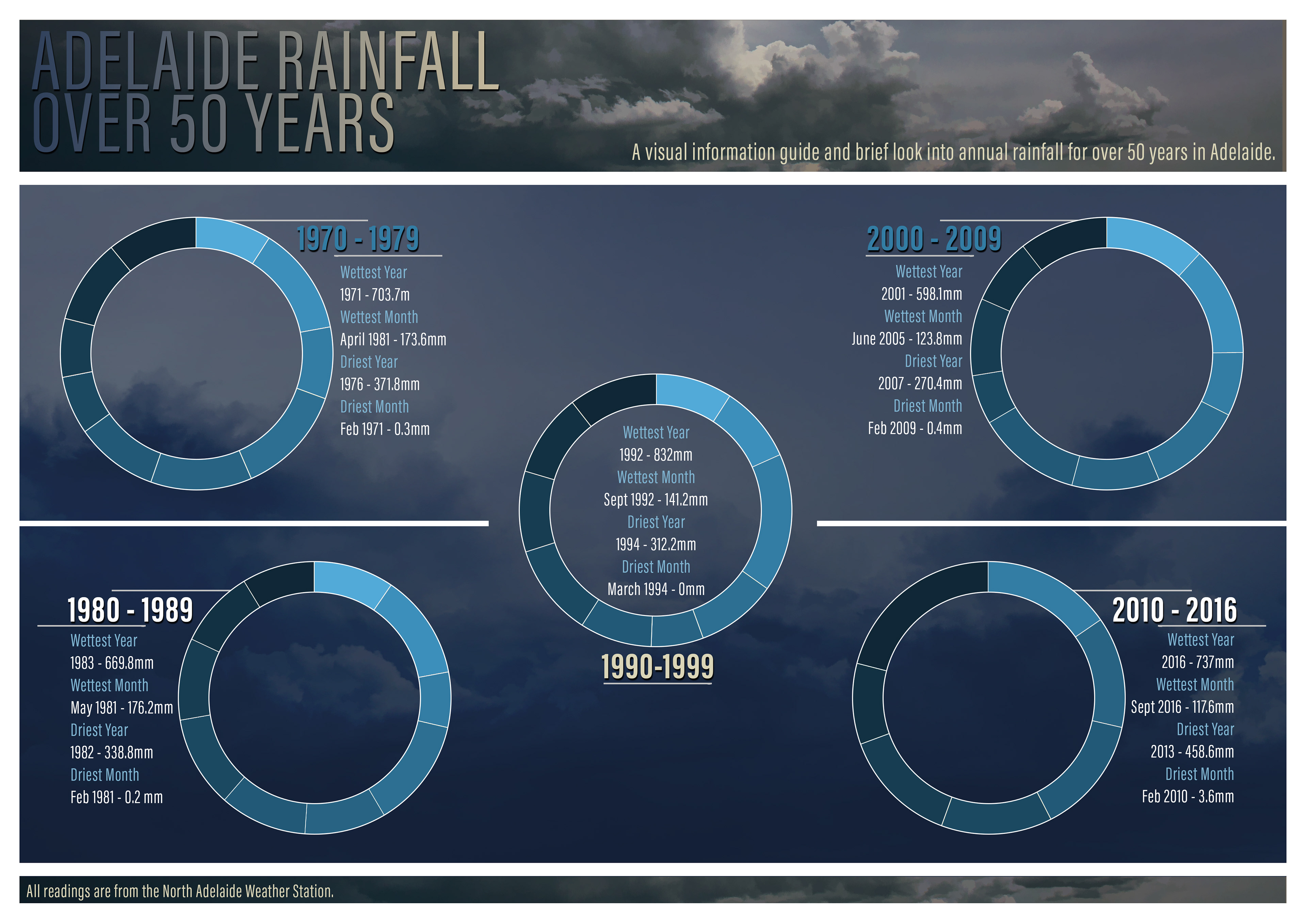
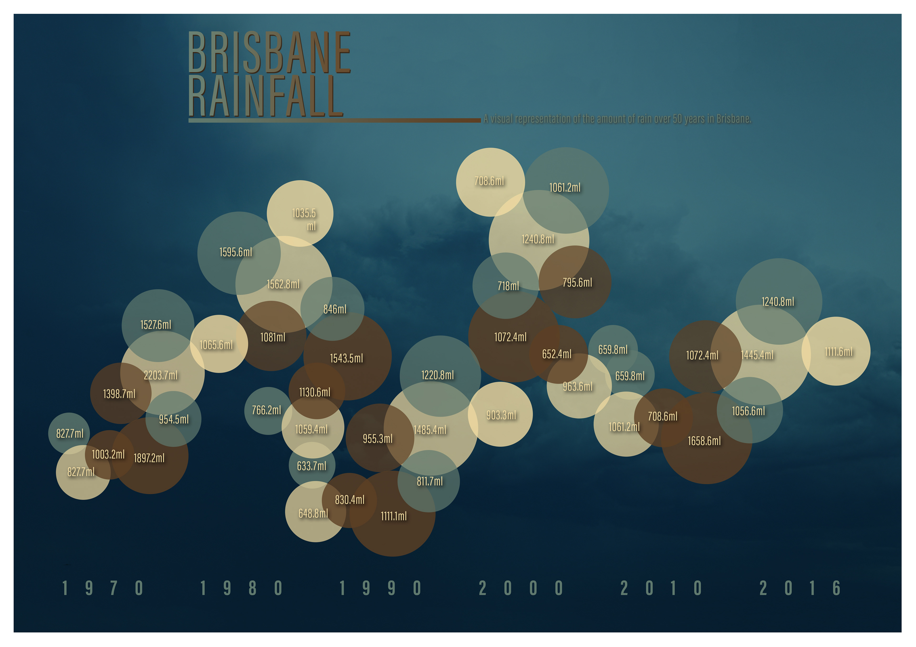
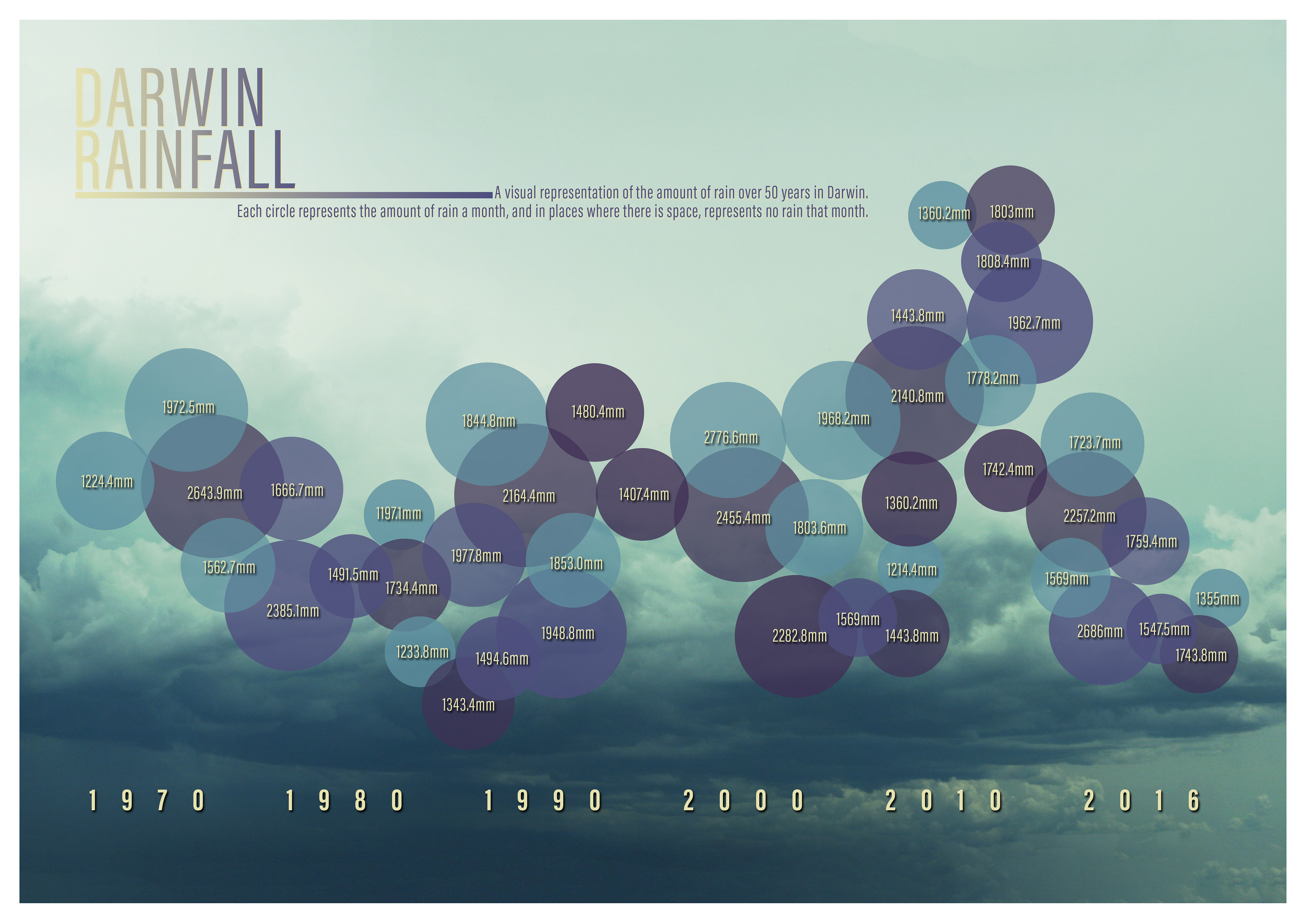
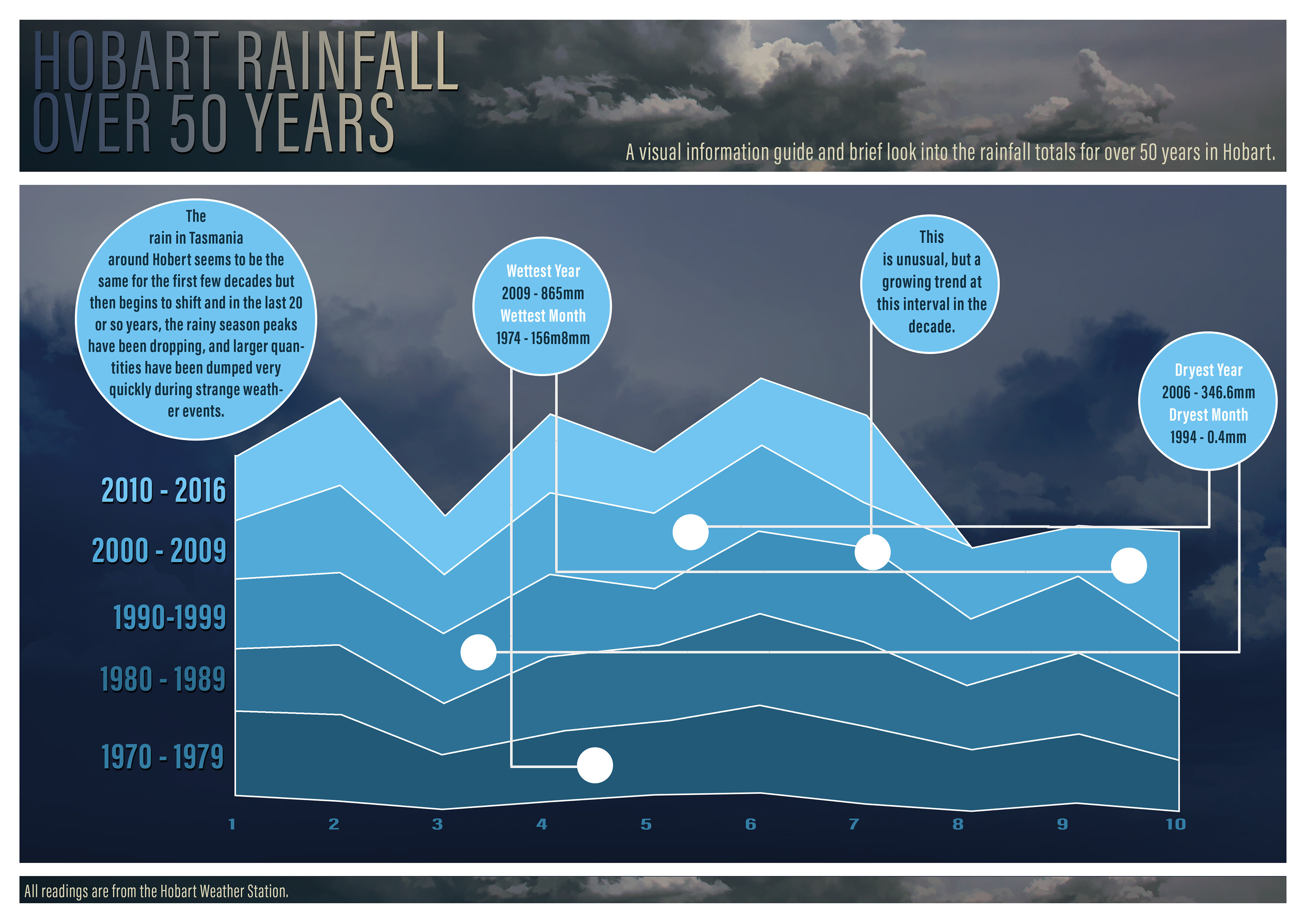
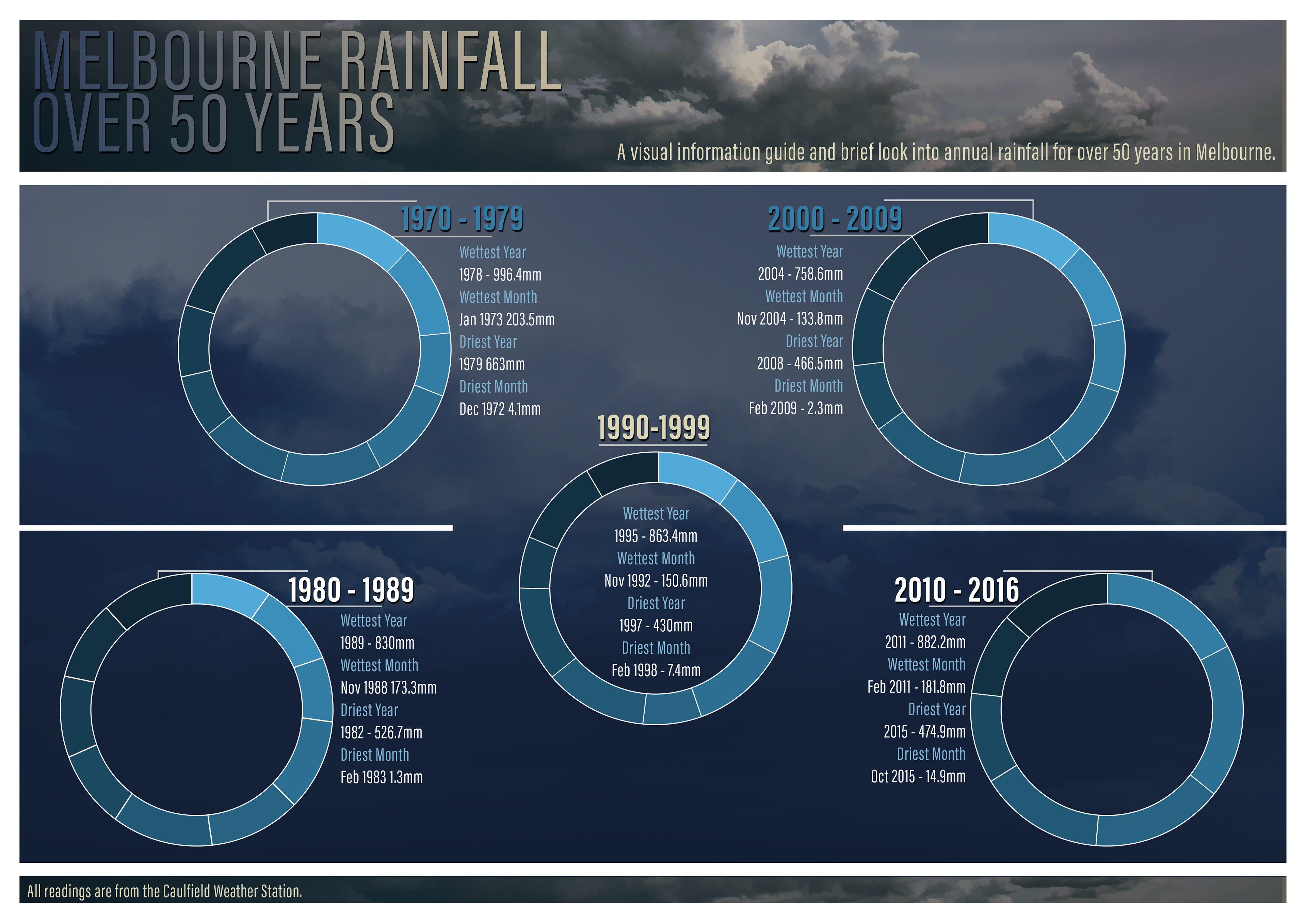
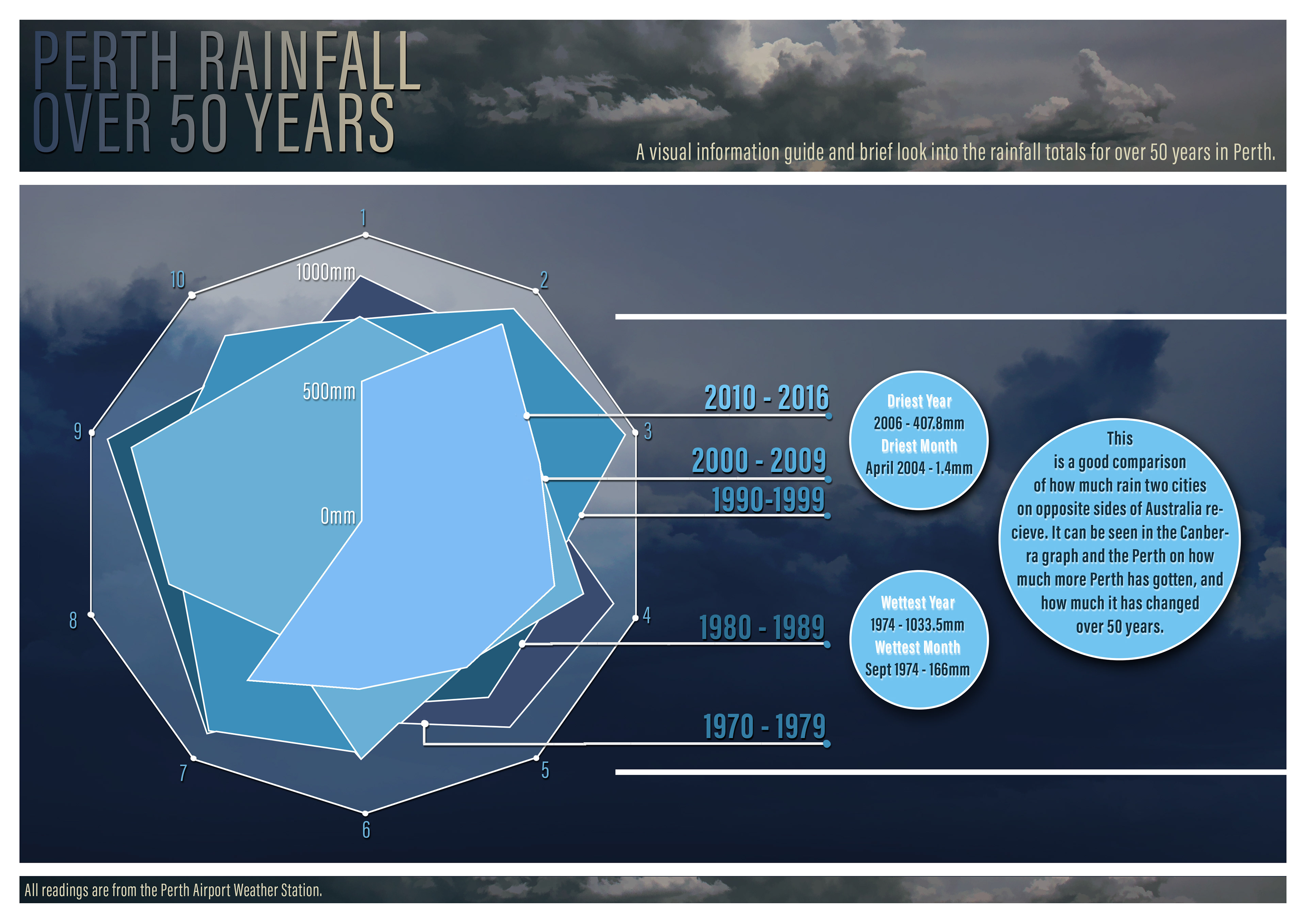
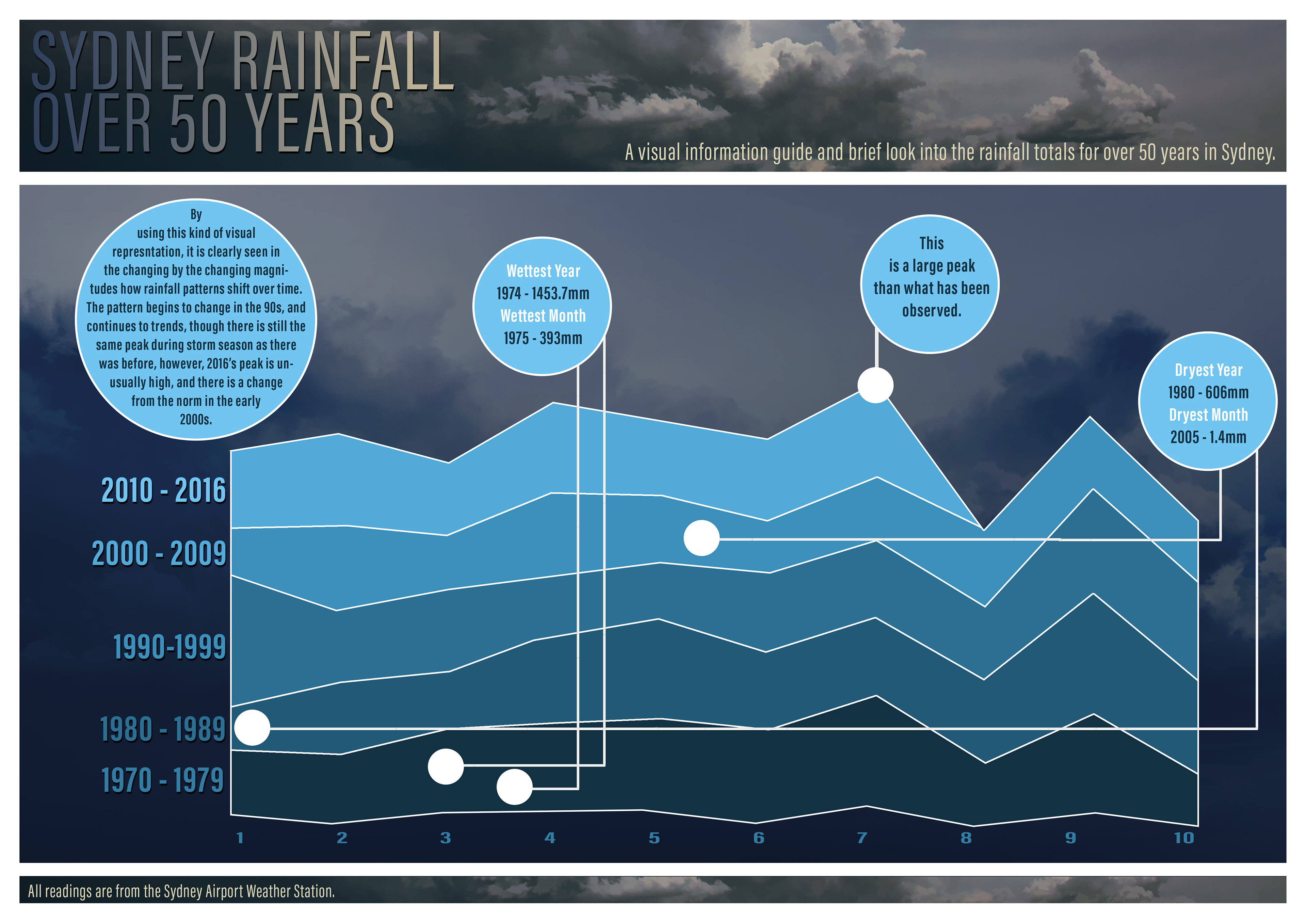
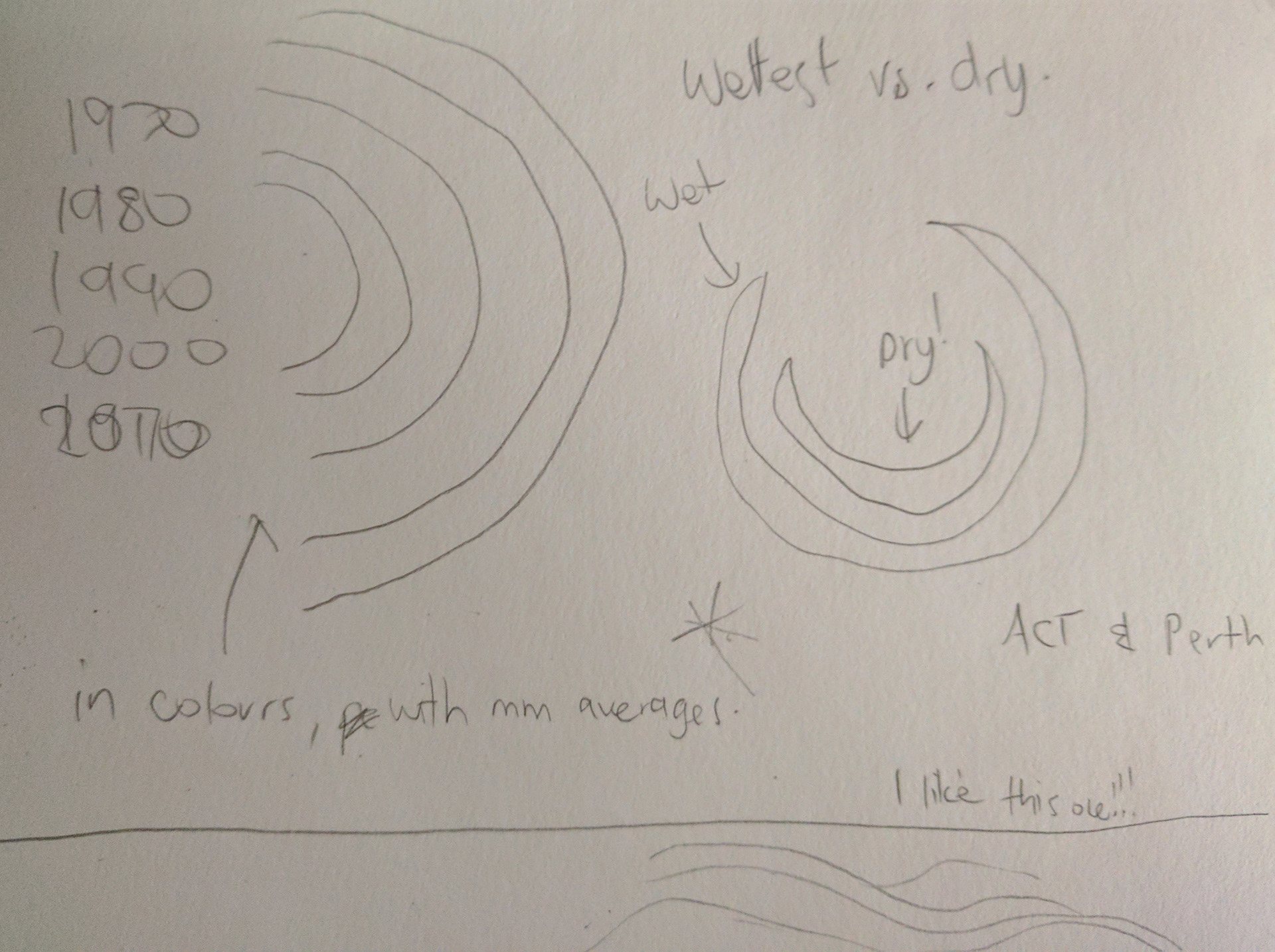
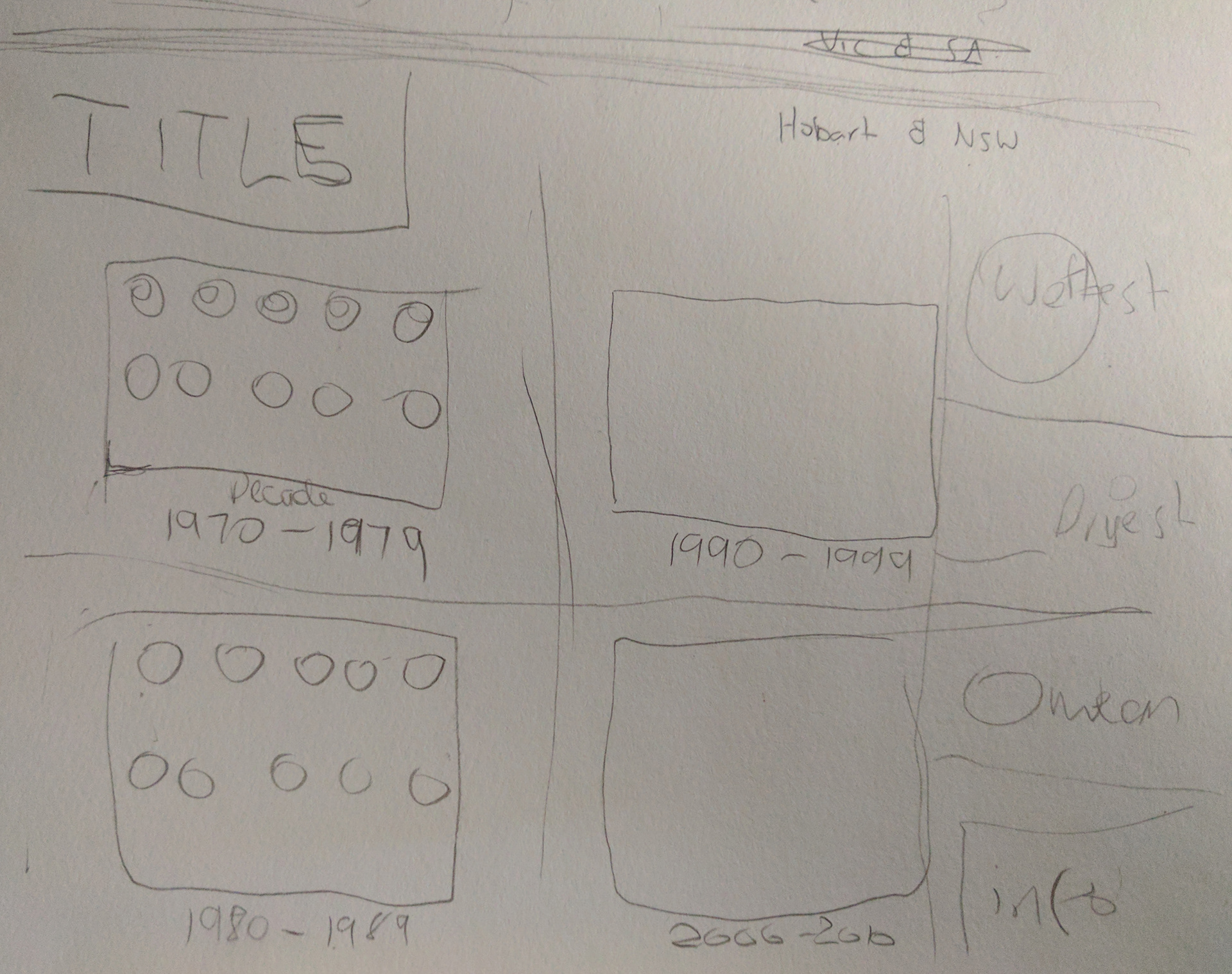
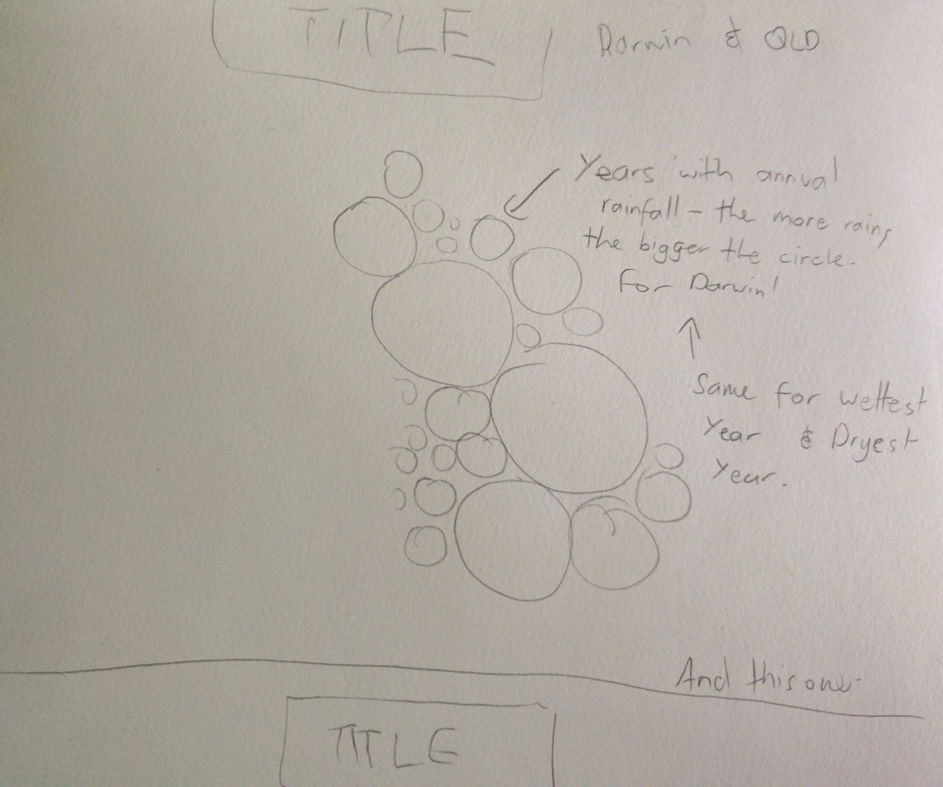
For the unit Information Graphics, our briefing was to find some statistics that could be represented as visual information. I went with the BOM Annual Rainfall for Australia to create a series of different info graphics to represent how much the median rainfall has changed over the last 50 years. Not all these graphics worked out as I had planned and some didn't work out right, but overall, the info graphics show different ways of representing a series of statistics.